Formula 1 unveils new logo for 2018 (Update)
 |
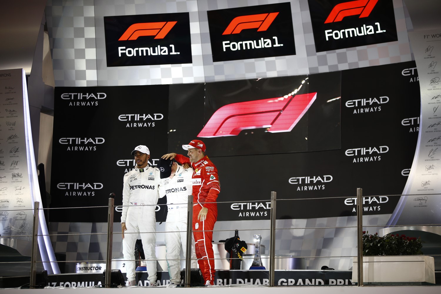
| New logo unveiled on podium |
UPDATE ESPN.com's Laurence Edmondson reported F1's new logo "received a mixed reaction" among the podium finishers at the Abu Dhabi GP.
Valtteri Bottas said, "I like the old one better. I kind of liked the old one. I only saw it very quickly [the new one] … but what's wrong with the old one? I thought it was quite cool."
Lewis Hamilton said, "The one we had was an iconic logo I think. Just imagine if Ferrari or Mercedes changed their logo. I mean the new one, I don't think is as iconic but maybe it will grow on us." ESPN.com.
Noble also reported Liberty Media's decision to change F1's logo received the "official backing" of FIA. FIA President Jean Todt said, "It is an evolution. And incidentally the commercial rights holder can change the logo with the agreement of the FIA — and they are very professional people." MOTORSPORT
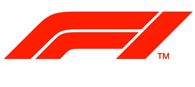 |
| New F1 logo |
11/26/17 Formula 1 has unveiled its new logo at the 2017 season finale in Abu Dhabi.
The more simple design will be used from the start of the 2018 campaign and features the F1 in solid red.
The new logo replaces the iconic 'flying one' design which was first adopted in 1987 and marks one of the most visible changes since Liberty Media became the commercial rights holders of the sport a year ago.
Formula 1 commercial director Sean Bratches explained the reasons behind the move as well as the timing of the announcement.
"From a broader perspective we would like to include this in a much larger brand relaunch which will take place in March, where we are going to relaunch the brand and introduce a new graphic package for our television production," Bratches said. "We are going to unveil a new production conceit, unveil a brand new responsive web platform, social capabilities, a live- and non-live OTT platform.
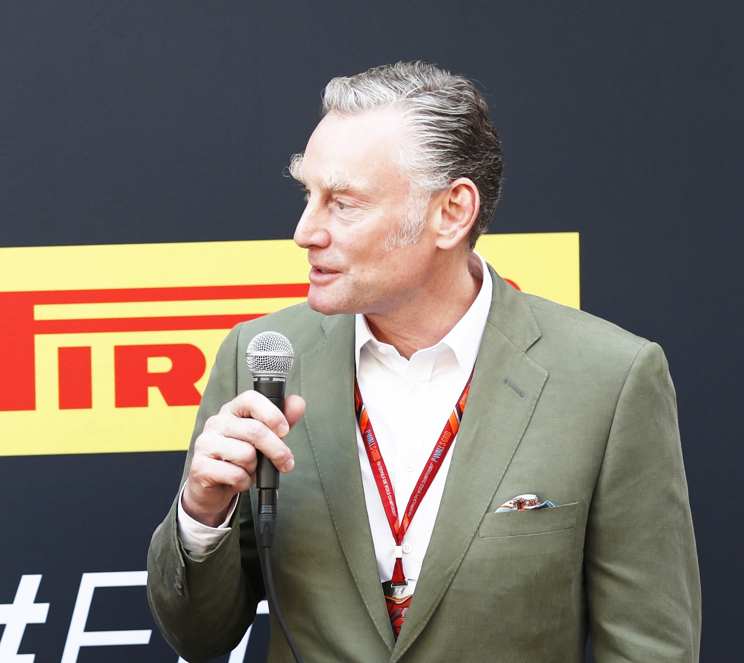 |
| Bratches at Abu Dhabi race |
"Because this is Formula 1 and we have to prepare for the future, the last grand prix concludes today, so we needed to provision this mark to our promoters, our sponsors, our broadcast partners. We have a new merchandise partner next year, we're going to have a massive store – you're not going to be leaning over tables to buy stuff, there's going to be fixtures and changing rooms, so we had to provision the mark early. So we thought this was an opportune time to outline what we feel is a mark that will take us into the future.
"We hold in high regard the incumbent mark. It's served Formula 1 extremely well for the past 23 years but in terms of where we're taking the business and our vision for the business, the negative space in the '1' doesn't come through candidly in digital. In fact, if I had marked or polled the number of people who I have met and discussed the mark since I've gotten here, many of them went years and years not understanding that the invisible space between the left and the right was actually a '1.' So we wanted to keep it simple and clear, and I think that's important for our digital space.
"Secondarily, as we develop and build a brand, particular in the world of licensing – and we do have an extraordinary brand which we feel fights at the high end of everything we do – you really can't stitch the chevron to the right. So as we are trying to reposition Formula 1 from a purely motorsport company to a media and entertainment brand with the heart and soul of a racecar driver in the middle of it.
"I think your brand and your mark represents the spirit of where you're going; it's an identifier for consumers in terms of how they represent the company or the brand. The number of brands, particularly in this day and age, who are trying to simplify their mark to enter the digital space. If you look at Starbucks as an example, or Coca-Cola, which has taken the condensation off its logo to enter digital. We felt we had to go a little bit further to re-tool it to position us on a going forward basis."
F1's marketing director Ellie Norman added:
"The new design is inspiration from what we learned from the fans and the associations which they want to have with the sport," Norman said. "Pretty simply, the fans want to get back to racing and what racing means to fans, and that's about the realness of it, the grittiness, the human element, and that kind of wheel-to-wheel racing.
"Wieden and Kennedy took that inspiration and have created this logo. It takes inspiration from the low-profile shape of the car, two cars crossing a finish line and it is incredibly bold and simple. But as we apply this in today's kind of market and being mobile and digital led, we have much more flexibility and versatility with this logo.
"Another important factor was looking at motorsport, and motorsport is definitely sort of a segment which is full of logo upon logo. So we need to make sure this logo works alongside the team logos, our partners logos, promoters, etc."